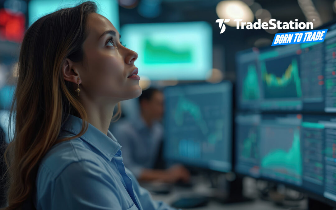
Market Insights
Opportunity knocks for those with trading in their DNA.
Curiosity creates opportunity. Insights create strategy. Born traders create their destiny.

TITAN X Has Arrived. Matrix Will Never Be the Same
The next generation of our award-winning platform has arrived, with powerful new tools and functionality.

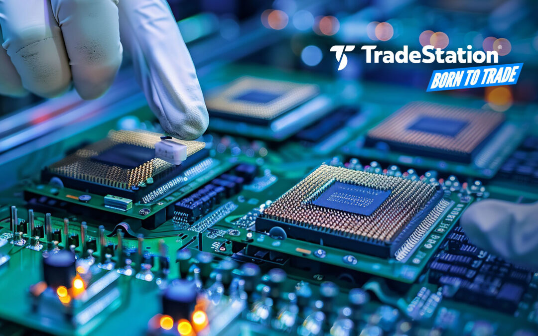
Tech Splits: Is the Megacap Trade Finally Over?
The technology sector could be splitting as investors focus on smaller chip stocks and abandon megacaps.

AI, Datacenter Unwinds Continue as Oracle Slides
Worries about Oracle weighed on several companies exposed to datacenter investment.

What Are Eurex’s DAX and Euro Bund Futures?
Global markets trade almost around the clock, and many active traders follow price action overseas before the U.S. session begins. Two noteworthy European futures products are the DAX Index futures and Euro Bund futures. Both trade on Eurex, a Frankfurt-based...

Trading with Confidence in HUB
TradeStation HUB is a browser‑based workspace that lets you see positions, manage orders, and place new trades from a single, streamlined view. It focuses on clear navigation and in‑line controls so you can act quickly without jumping between multiple windows.
Key Options Knowledge: Time, Volatility and Different Kinds of Value
Options confuse a lot of investors because several factors impact their value. Unlike stocks, they don’t just go up and down based on supply and demand. This post will explain three of the most important concepts you need to get started: time, volatility and intrinsic...

Chart of the Day: Alphabet May Be Oversold
Alphabet has pulled back after hitting a new all-time high, and some traders may think it’s oversold.
Technology & Communication

Tech Splits: Is the Megacap Trade Finally Over?
The technology sector could be splitting as investors focus on smaller chip stocks and abandon megacaps.

Chart of the Day: Alphabet May Be Oversold
Alphabet has pulled back after hitting a new all-time high, and some traders may think it’s oversold.
The Year’s Leading Megacap Reports Earnings Thursday
Did you know Broadcom has risen twice as much as Nvidia so far in 2025?

Are Brighter Spirits Lifting Risk Appetite?
Risk appetite may be increasing in the stock market as sentiment shows signs of improving.
Traders Face Choices After Pullbacks in Big Tech
Tesla, Nvidia and Palantir may be stabilizing after a bout of volatility, and active traders face big choices.